M1
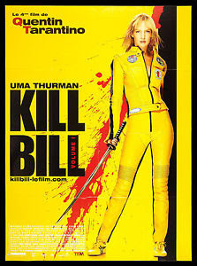
 The trailer for Kill Bill matches the other more print based advertisements with the colour schemes, fonts and main role of both advertisements being the same. The colour scheme in the trailer matches the yellow on black colour scheme of most of the print based advertisements like the posters and billboards have. When the trailer shows the cast, director and producer it is followed with a black splatter which is meant to represent blood which fits in with the use of blood within all the other more print based media as well as the black bar used on the poster. All fonts used within the trailer match the bold black text for the poster, billboards and other advertisements all which stand out a lot. The main focus within the trailer is Uma Thurman's character wearing the eye catching and iconic yellow and black jumpsuit and that is the same for all of the print based advertisement.
In both the trailer and the print advertisements the movie is well represented of the genre that it is which is a thriller. Both forms of visual and print advertisement represent the thriller genre with genre conventions like the use of blood and blood splatters, having weapons, violence and fighting as well as the name of the film itself Kill Bill which appears in both the advertisements and the trailer. The correlation of the vibrant yellow and and black within the trailer and advertisements is very eye catching and stands out well. The use of the two colours act almost as a brand being very recognisable with the yellow and black jumpsuit Uma Thurman wears, the billboards and posters all easily recognisable for being related to Kill Bill.


Comments
Post a Comment